Turning Per-Client Branding From Hardcoded CSS Into a Single Token Edit
A design systems case study for a multi-tenant talent engagement platform: three-layer token architecture, a bespoke component library, and 50+ custom icons built for 15+ client brands.
Disclaimer
Note that, I've omitted any confidential information from this case study. The insights shared here are my own and don't necessarily represent the views of Hollaroo ltd.
Context
Hollaroo is an enterprise talent engagement platform: private social networks used by organisations like Dentons, Capgemini, and ASDA to build communities, nurture candidates, and streamline recruitment workflows. Every client requires a branded experience - their logo, their colours, their fonts, their tone.
I owned the design and theming work. I aligned the vision with the project manager, and partnered with developers to make the system work end to end. I designed the client experiences in Figma and built the style systems in SCSS, polishing the legacy templates so visuals improved as fast as possible. This case study covers how a per-client branding problem became a system problem, and what that system was worth to the business.
Challenges
There were multiple layers that required addressing:
Branding Was Bespoke Work
The old approach was entirely bespoke. A designer made mockups, a developer hard-coded them, and any future update meant digging through spaghetti CSS. Every new client repeated the whole cycle from scratch, and nothing was reusable between them.
No Single Source of Truth
Visual values were defined in templates and overridden in stylesheets, so the same component could look different depending on where it was rendered. Fixing anything meant auditing everywhere, which is why updates were slow and drift was invisible until it was expensive.
Client Onboarding Cost
Onboarding a client depended on hand-built customisation rather than configuration. My colleague ran that process, and without a shared system every client consumed design and development time just to get to the same structural starting point.
A Spritesheet Holding The Interface Together
One icon spritesheet served the whole platform, with positions mapped through SCSS. It saved server requests, but it fixed resolution so icons scaled poorly, over 1MB on first download, and any new icon or positioning change meant editing the entire spritesheet and the code that indexed it.
Strategy
Rebranding the platform as a whole was not an option: it was live, revenue-generating, and serving 15+ tenant configurations at once. The work had to land in the existing templates, improving them as fast as possible rather than replacing them.
So I split the problem in two. Values became tokens - one place to change a colour, spacing step, or radius, with every component reading from it. Structure became primitives - a shared component library that stays visually neutral so a client's brand can flow through without fighting a framework's own identity. A new client then means a new set of values, not a new set of styles.
Discovery & Research
Before designing anything new, I needed to know what was actually varying between clients. So discovery started as an inventory of the existing product rather than a moodboard:
Full Interface Audit: I audited the entire interface and extracted every visual property in play: colours, typography scales, spacing, border radius, shadows, and breakpoints. The important finding was not any single value but the pattern - the same decisions were being made again and again, in slightly different forms, which is exactly the shape of work that belongs in tokens.
Templates & Stylesheet Mapping: I mapped where those values were defined and where they were overridden, then consolidated them into tokenised SCSS variables. That rework gave the team a single place to change styles, and it is the reason the rest of the system could be built on top instead of alongside the old code.
Existing Client Brands as the Test Set: The branded experiences already in production became the acceptance criteria. A system that could not restyle an existing client brand was not finished, so every later layer - tokens, primitives, icons - had to survive being pointed at real brands rather than a single fictional one.
With the inventory done, the question shifted from "what should this look like" to "what is a role rather than a value" - which is where the three-layer architecture came from.
The Token System: From Values to Roles
Changing a single value now propagates across every card, button, badge, input, and modal in the system. The architecture follows a three-layer model: global values (raw colours, spacing numbers), semantic tokens (what a colour means - "action-primary", "surface-secondary"), and component tokens (how a button uses those semantics).
This separation is what makes the system mature: "blue" is a colour, but "action-primary" is a role, and that distinction is what allows per-client theming to work by swapping values rather than rewriting styles. When the frontend was later rebuilt in SvelteKit, those same tokens carried over into CSS custom properties, so the whole system stayed consistent across the framework change.
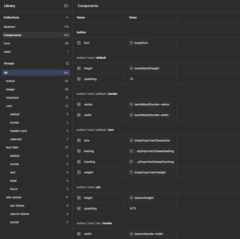 Three-tier token architecture: raw values, semantic roles, component usage.
Design Guidelines
A design system is only as good as its documentation. I created a comprehensive set of guidelines that serve as the single source of truth for every designer and developer working on the platform. By establishing strict geometric conventions - including an 8pt spacing grid, standardised shadow depths, and a predictable corner radius scale - I created a framework that eliminates guesswork for everyone.
The colour system was engineered to balance functional hierarchy with emotional brand impact, utilising a robust neutral scale to provide structure and a high-contrast primary palette for clear action-oriented cues. The typographic scale prioritises information density and readability, using distinct weights and line heights to establish a clear hierarchy for complex data-heavy screens.
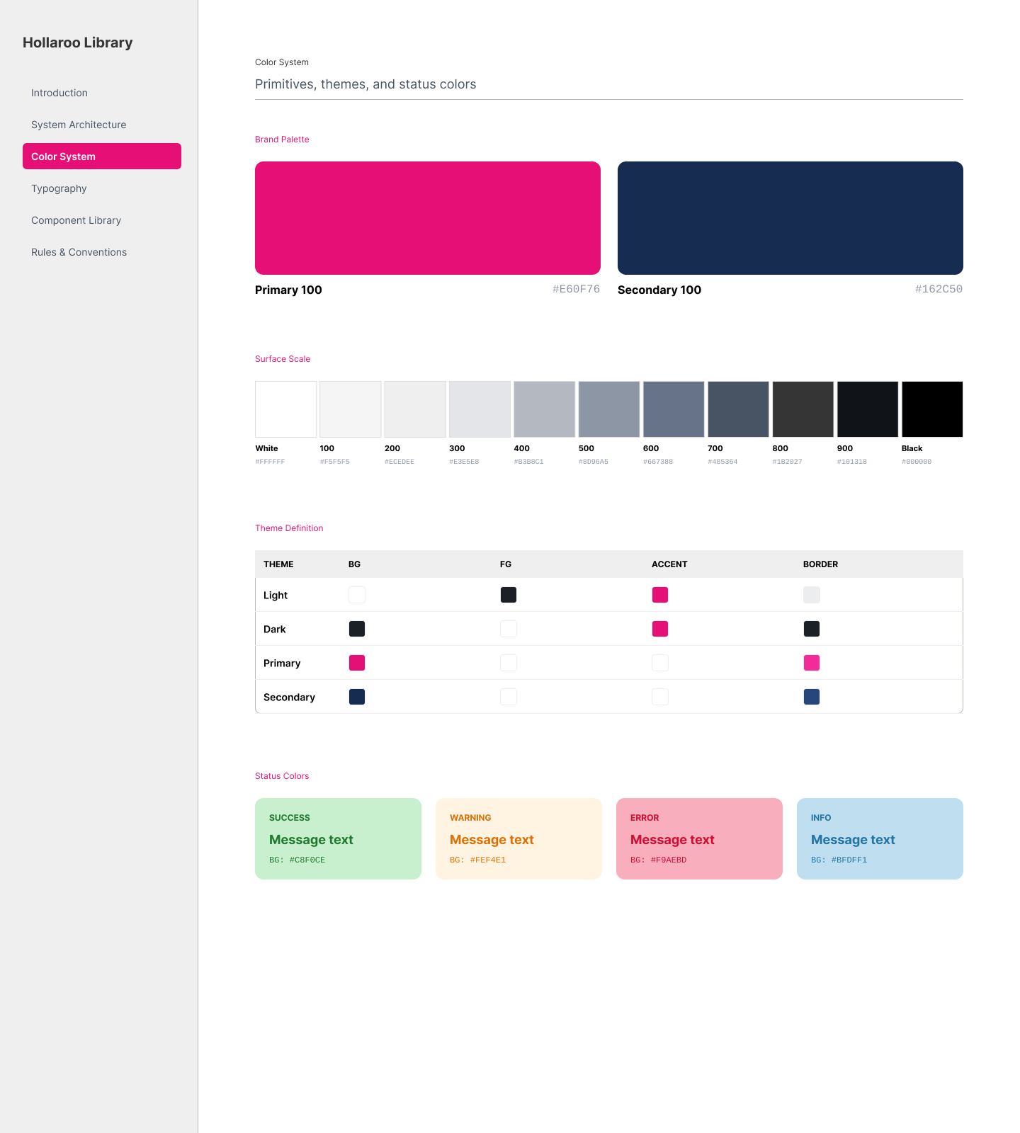 Colour grouped by function, so a client palette maps onto roles rather than guesses.
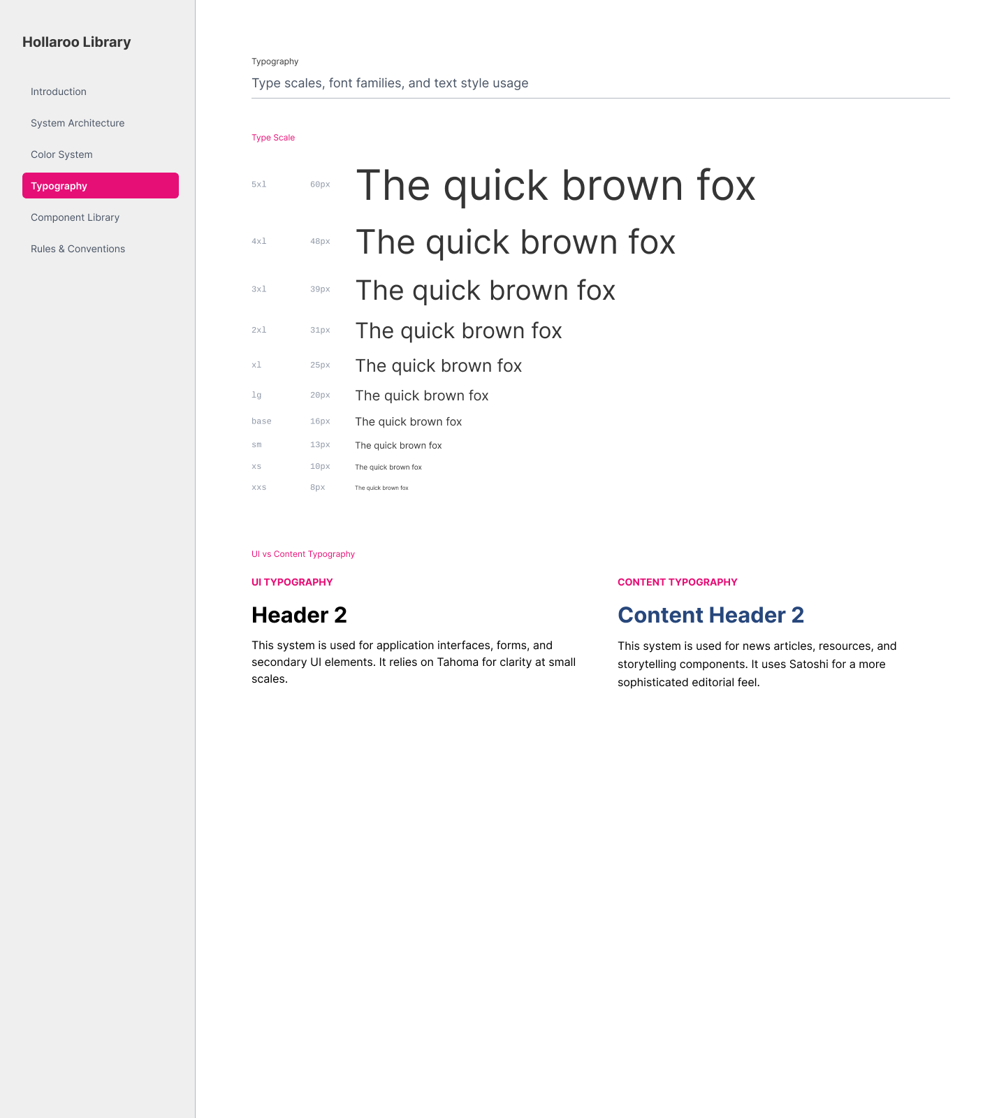 Typographic scale tuned for information density on data-heavy screens.
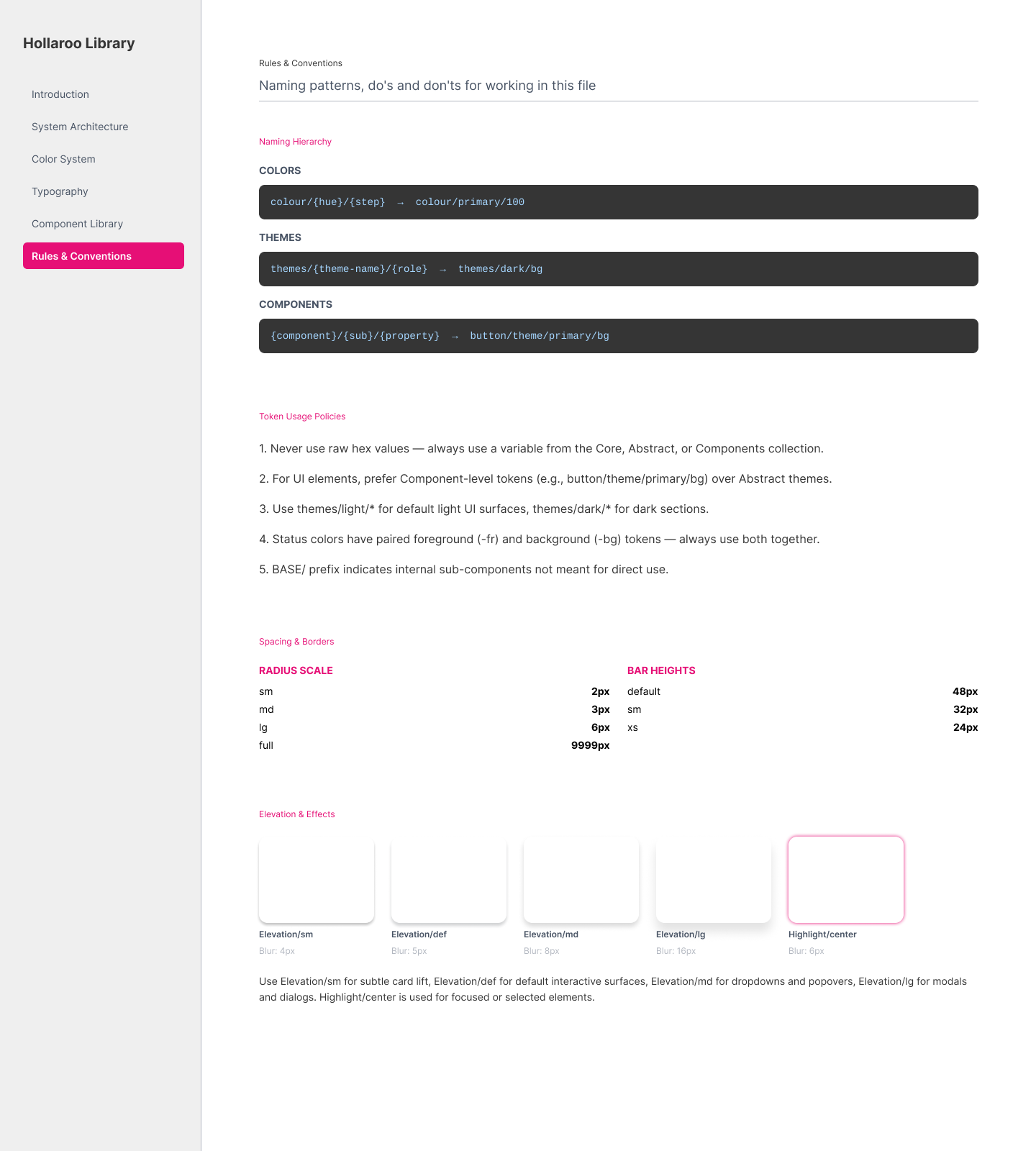 Conventions that remove guesswork: 8pt spacing grid, shadow depths, radius scale.
For Developers: A Component Library That Stays Out of the Way
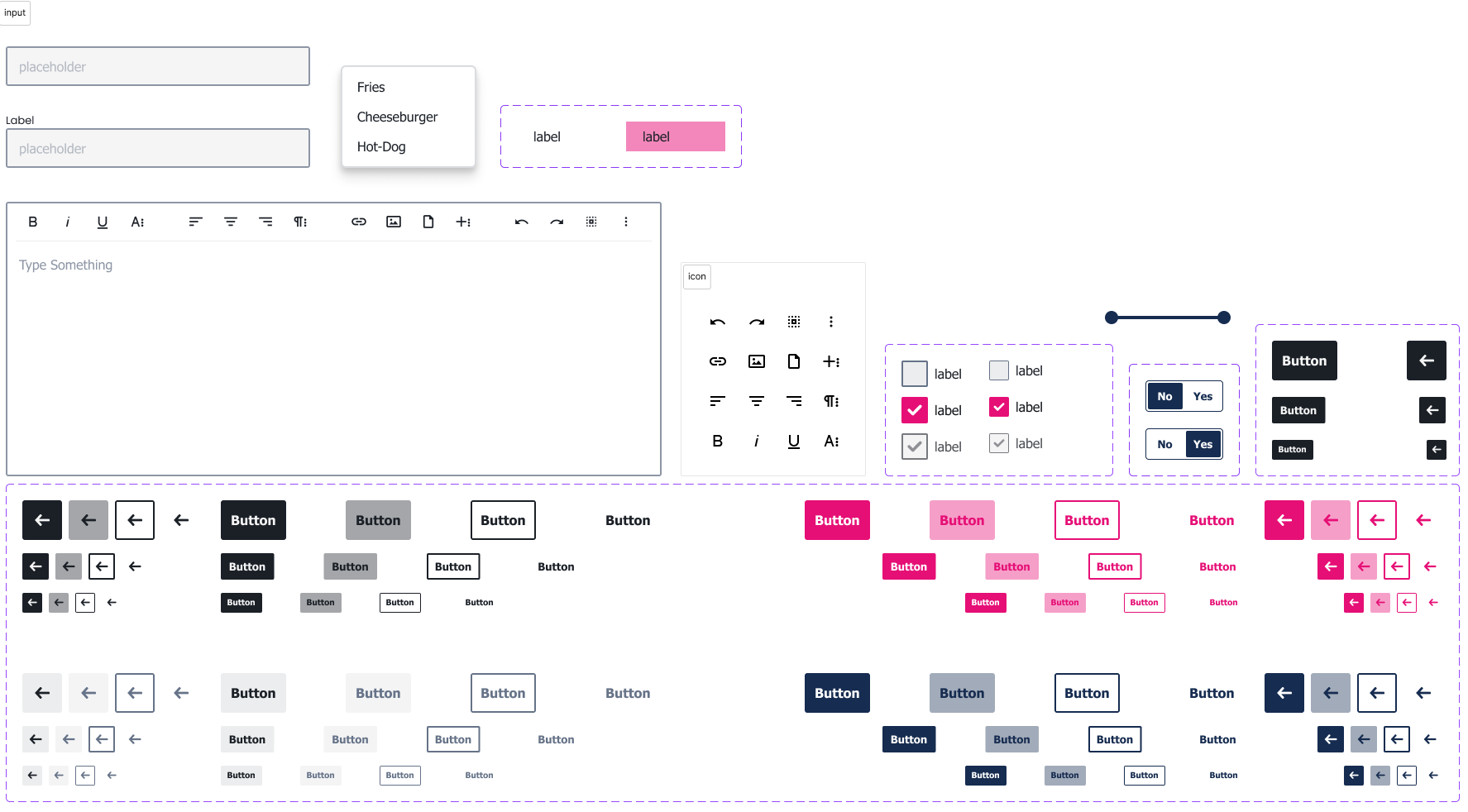
When the frontend modernisation later rebuilt modules as SvelteKit SPAs, I opted for a bespoke component library over a pre-built framework. Frameworks like Material UI or Shadcn carry their own visual identity, which would conflict with per-client branding. Building our own primitives ensured the components were perfectly tuned to the platform's needs and completely agnostic to client branding. The component system covers everything a social platform requires:
- Buttons: 3 sizes, 3 styles (filled, outlined, ghost), 4 theme variants (primary, secondary, dark, light), plus disabled and square states
- Badges: Same variant system with counter/naked styles
- Cards: Header/content/footer regions with interaction states (hover, selected, disabled)
- Inputs: Text, textarea, select, checkbox, radio, switch, combobox, date picker, range slider, location filter, file upload, image cropper
- Overlays: Modal (stack-based, supports alert/confirm/prompt/component), toast (queue-based with autohide and hover-to-pause), popover (Floating UI), tooltip, accordion, menu
Every visual property is driven by CSS custom properties, so client branding flows through automatically. That is the whole point of the library: a developer picks a component, and the tenant's brand is already in it.
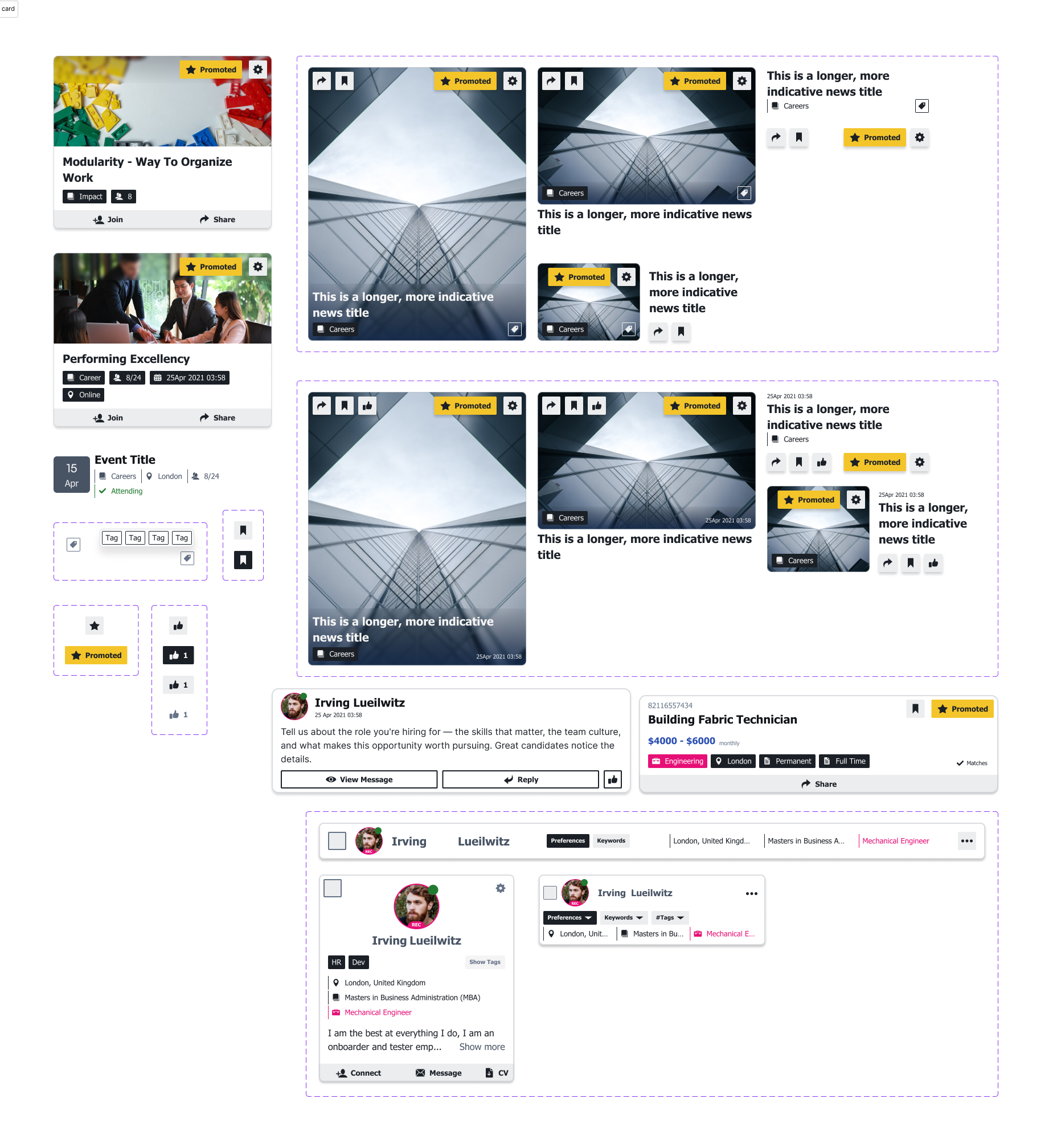 Card primitive with header, content, and footer regions plus interaction states.
For Designers: One Visual Language Across the Platform
The old icon system relied on a single spritesheet, with positions mapped through SCSS so individual icons could be used. The new system uses standard SVG icons, componentised so they stay crisp at any size and load only when needed.
Every icon shares a uniform stroke weight, corner radius, and bounding box, with geometric
consistency built on a strict grid rather than drawn freely. Each icon is a Svelte component
exporting an SVG path, registered in a typed properties map. The Icon wrapper
resolves them with configurable size, fill/stroke, and opacity, all driven by currentColor so they adapt to whatever theme context they appear in. Clients can
swap in their own icons without touching component code.
The icon system was designed to pair with the illustration work used across the platform, so empty states, onboarding flows, and feature highlights all feel like part of one visual language rather than a collection of separate assets.
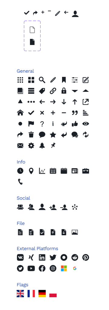 50+ icons on one grid, with stroke weight and bounding box held constant.
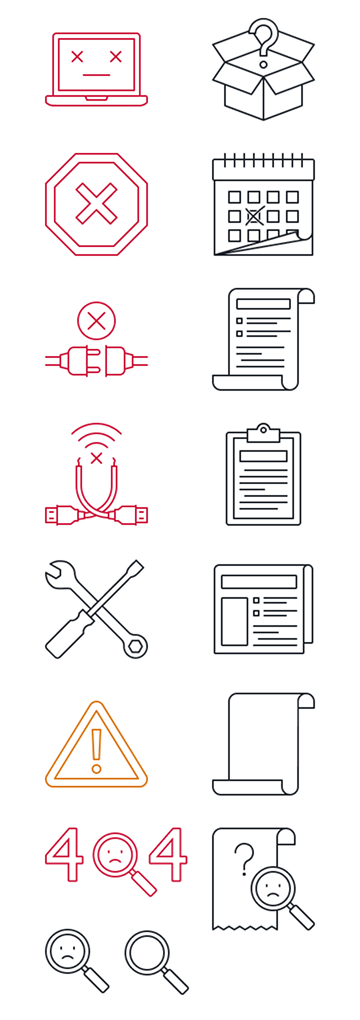 Illustration assets sharing the same geometry and restricted colour palette as the icons.
For the Business: Branding at Marginal Cost
I supported our client onboarding process, presenting customised designs and making live design changes during sessions with clients. The workflow we followed:
- Discovery: Understanding each client's brand guidelines, target audience, and goals for the platform
- Mockups: I've designed interactive mockups of their customised homepage and key screens - showing exactly how their branding would translate
- Approval: I presented the mockups in live sessions, iterating on feedback on the spot and securing sign-off
- Implementation: Mapped their brand tokens onto the token system, built the custom pages and deployed the themed experience.
This replaced a manual, error-prone process with a streamlined pipeline. Clients could see their branded interface before a single line of production code was written. I also moved clients assets from Google Drive to GitHub, giving proper version history and change management.
Beyond theming, I designed and managed custom homepages, customer-specific features, and bespoke views, so each client got a tailored experience on top of the shared system rather than a generic template.
Impact
Client branding that once took hours of styling now can be finished in minutes, with fully branded experiences for clients like Dentons, ISS, University of Coventry. Each one stays consistent with the system instead of hard-coded and drifting apart. What started as a design problem ("every client looks different") turned into a systematic solution ("different looks cost almost nothing"). New clients went live a lot smoother, with consistent branding by default.
Client branding moved from manual styling per tenant to a token swap on the shared system.
Onboarding my colleague ran became materially faster because new clients configure values instead of requesting new styles.
Distinct brands served by one token system, surviving a full frontend framework rebuild.
The design system became the foundation for the entire frontend modernisation effort. When I rebuilt the homepage, profile, news, jobs, and other modules as SvelteKit SPAs, they all consumed the same token system, the same icons, and the same component primitives. The theming layer was never a separate concern, it was baked into the architecture from the start.
Learnings & Retrospective
Reflecting on the project, the shift from bespoke to systematic produced the largest gains, but it also showed where I would sequence things differently next time:
- Tokens outlive the framework they were written for: The SCSS variables became CSS custom properties when the frontend moved to SvelteKit, and the same system served both. That is the strongest argument for investing in the token layer early - it is the one piece of a design system that is cheap to carry forward.
- Neutral primitives beat opinionated frameworks here: Rejecting Material UI and Shadcn cost more upfront work, but it is the only reason a client's brand could pass through every component untouched. On a multi-tenant product the framework's identity is a liability, not a shortcut.
- What I'd do differently: start with the token layer: Everything that followed - the component library, the theming pipeline, the SvelteKit rebuild - depended on the tokens already existing. The order of work should have started there, with the legacy template polish running alongside it rather than ahead of it.